Summary
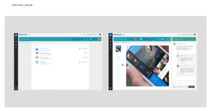
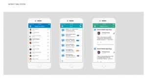
This is a new web, desktop and mobile product that we created by mashing up two existing cloud services that overlapped in functionality.
Role
I was the architect for this product and as such I coordinated with PM, engineering, 7 designers and 1 usability engineer throughout the process of defining information architecture, design system, product vision, feature set, design tenents and guidelines, etc.
Problem
We spotted overlapping and redundant functionality in two existing and competing products in our portfolio.
Opportunity
Create a new product out of the two and merge their code bases and customer bases to advance more rapidly and provide our users with more functionality. Simplify our portfolio of products.
Challenges
- Code Base: 2 different stacks. Once code base robust, the other young and modern.
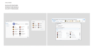
- Security Paradigm: 2 different security paradigms, one open, the other closed.
- Interaction Model: 2 different interaction models. No shared patterns or components.
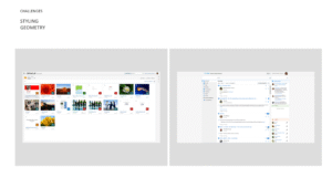
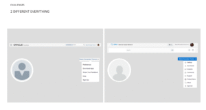
- User Interface: 2 different UIs. One developed in-house, the other externally. No shared design language.
- Team: 2 different sets of designers, developers, testers, PM’s, etc.
- Customer Base: 2 different customer bases. One large, but non-paying, one small but paying.
- Mental Model: 2 different collaboration mental models. One conversation centric, the other document centric.
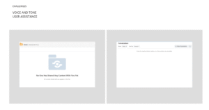
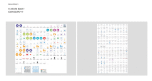
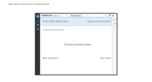
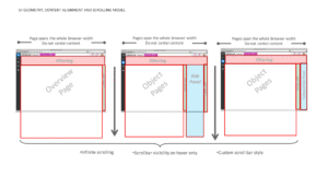
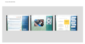
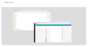
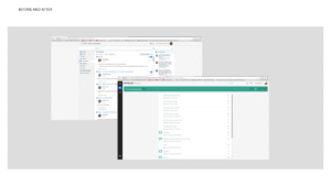
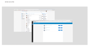
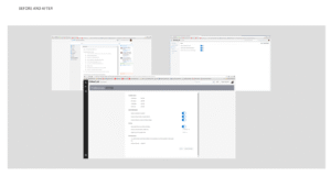
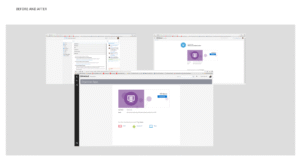
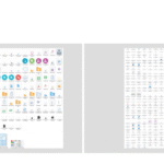
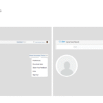
Everything was different between the products, including the page styling and geometry, the interaction models and security paradigms. There were duplicate features presented in a different manner. The voice and tone were completely different. The way user assistance was provided was also different between the two products. There was feature bloat and iconography bloat. In short, even the avatars were different, everything was different! We needed a new happy medium.
UX Goals
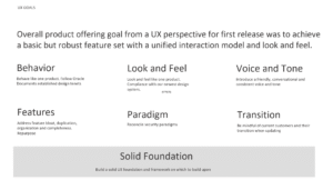
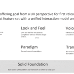
Overall product offering goal from a UX perspective for a first release was to achieve a basic but robust feature set with a unified interaction model and look and feel. A basic, solid foundation on which to build upon.
UX Strategy
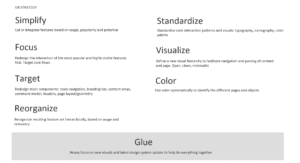
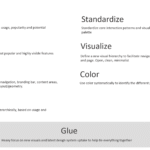
Strategically putting heavy focus on standarizing interactions and on new visuals and latest design system uptake to help tie everything together.
UX Tenents
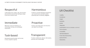
When designing features, always be:
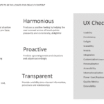
- Immediate
- Proactive
- Task-based
- Transparent.
Usability Plans
Starting with a focus group, we would then do an end-to-end usability test of V1 before release, and during the development of V1 we would start testing new V2 features as needed.
Outcome
- Release V1 was successful and strong. So strong was the foundation we built that it proved easy to integrate and absorb a third product from our existing portfolio by just applying the same tenents and patterns established for V1.
- After intial merge, we have been focused on growing the feature set to support governance, content editing, curating, analytics, AI, and integrations with Commerce Cloud all on top of a very solid interaction and design base.
Lessons Learned
- You don’t need a lot of people. Ultimately, 1 architect, 1 creative director, 2 artists, 1 usability engineer, and 1 UX lead were enough to complete this ambitious web, mobile and desktop product. Supporting UX designers would have been nice though.
- You do need a plan. Plan, prioritize then execute with razor-sharp focus
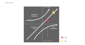
- Set expectations. Set expectations with Engineering and PM from the get go. Be ambitious, but realistic.
- Shoot for the moon. Shoot for the moon, even if you miss, you’ll land among the stars. Engineering and PM are still working off of the UX roadmap 3 years later.
- Document. Documenting and sharing decisions, patterns, resources, assets was a challenge. This got addressed after the release.
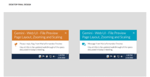
- Careful with color. Colored banners quickly got out of control, we ended up shipping only blue and gray banners.
Walkthrough
