Summary
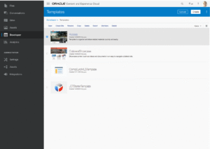
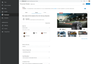
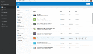
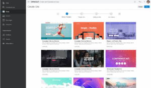
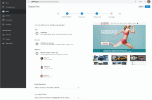
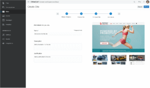
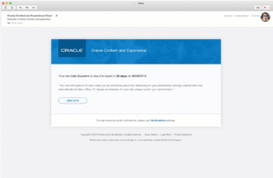
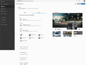
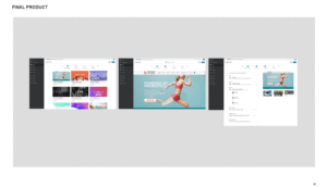
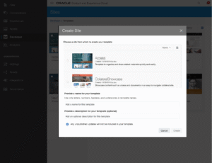
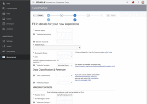
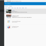
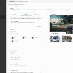
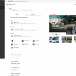
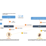
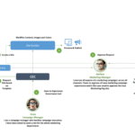
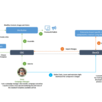
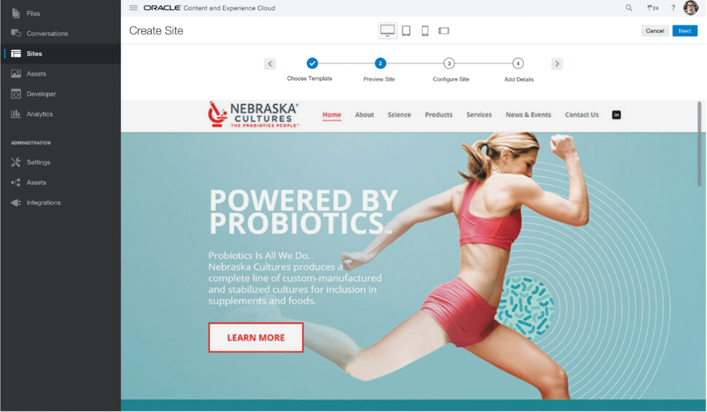
This is a simple and easy to use site builder built within our application with governance capabilities built into the workflow to ensure administrators maintain control of branding and security.
Role
I was the lead designer for this feature and as such I coordinated with PM, engineering and other designers throughout the process of driving this feature to completion. I designed all the interactions and for the visuals, since we weren’t building using the design system platform, we needed to mimic the design system in our own stack, so I worked closely with a visual designer to define visuals consistent with Oracle’s Design System.
Problem
Companies deploy a multitude of experiences, or websites, today. These experiences need to be created and deployed quickly. These experiences are often running on multiple web content management (WCM) systems which creates a complicated environment.
Business Opportunity
Our existing site creation and site management offering is very basic and doesn’t allow admins to have full control over the security and consistency of the websites created by employees in their organization. We need to support what is commonly known in the industry as “Site Governance” to enable marketing teams to guard their brand integrity and security.
Personas
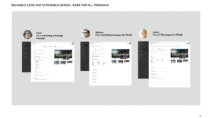
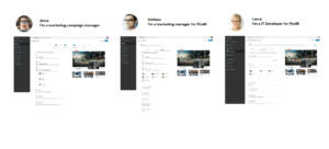
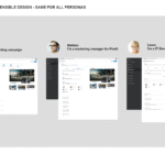
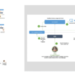
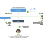
This feature area spanned several of our core personas.
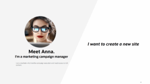
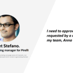
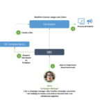
- Anna: the campaign manager
- Andrea: the IT Site Admin
- Conrad: the content manager
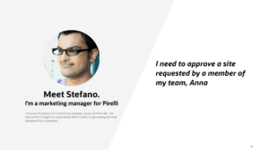
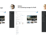
- Stephano: the marketing manager
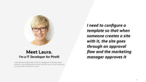
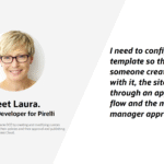
- Laura: the IT site developer
Competitive Analysis
Because we wanted to continue to be a light-weight, yet powerful, WYSIWIG site creator for marketers primarily, I focused our competitive analysis on 3 very popular and consumer oriented competitors:
- WIX
- Weebly
- WordPress.
Process
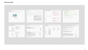
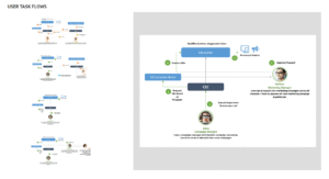
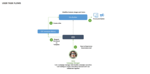
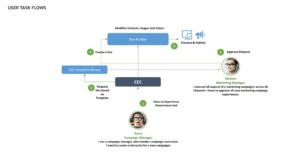
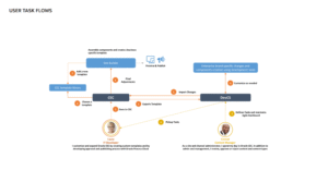
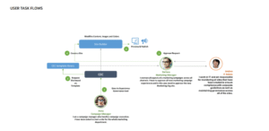
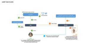
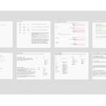
First I got familiar with the PM spec and requirements and had an initial conversations with Developers to learn about the technology and its limitations. This all informed my next steps, which in this case included competitive analysis and required the creation of task-flows and user stories to document the different scenarios and their limitations and edge cases. I also committed to doing frequent UX reviews throughout the development of the feature area for UX quality assurance.
Usability Testing
I am proud to be able to test our creations whenever possible because I am trained to design and execute usability tests. This feature area, being so controversial because of the heavy re-work I was proposing, merited and got usability planning and testing to ensure the core flows were usable and to document and justify the need for an upgraded, more scalable, and more modern UX.
Challenges
- Push back against the heavy re-work (migrating dialogs to full-page experiences) which we justified with usability results and identifying scalability issues.
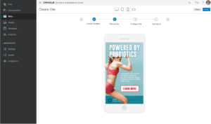
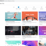
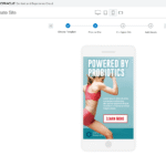
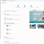
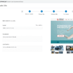
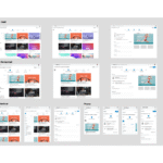
- Issues with the preview intensive experience we proposed. We just didn’t have the image quality to produce high-fidelity previews like we designed, but low-fidelity previews were better than no previews in the end.
- Building on top of 5 different servers with 3 different UI technologies. Not using Oracle’s UI platform. Dealing with legacy server code from the on-premise version of the product. All this was handled by working around the technical limitations, so a lot of back and forth had to happen with Development.
- I inadvertently created more work for myself and the team. When the team saw what I had done for site governance, they wanted me to update the non-governed site experience as well. This wasn’t so much of an issue, perhaps this was even a success, but not if you were already dealing with a full plate like I was. But not to worry, I had a process in place to just add the work to my list of issues I had to tackle in Jira and prioritized accordingly.
Lessons Learned
- You don’t need a lot of people if the parties involved are committed and on-board and expectations are laid out from the get-go.
- You do need a plan and an end-to-end short and long-term vision. I designed the end-to-end story at a high-level for every persona from the very beginning. With that in place, it was easier to sell the vision and together break it down into parts for implementation and detailed design.
- Push for big changes, if you can back them up. The new experience for sites governance I designed was successful, so they decided to also upgrade the non-governance experience.
- Writing user stories and doing UX reviews pays off. UX QA control before and after each iteration became a must!
Walkthrough
